


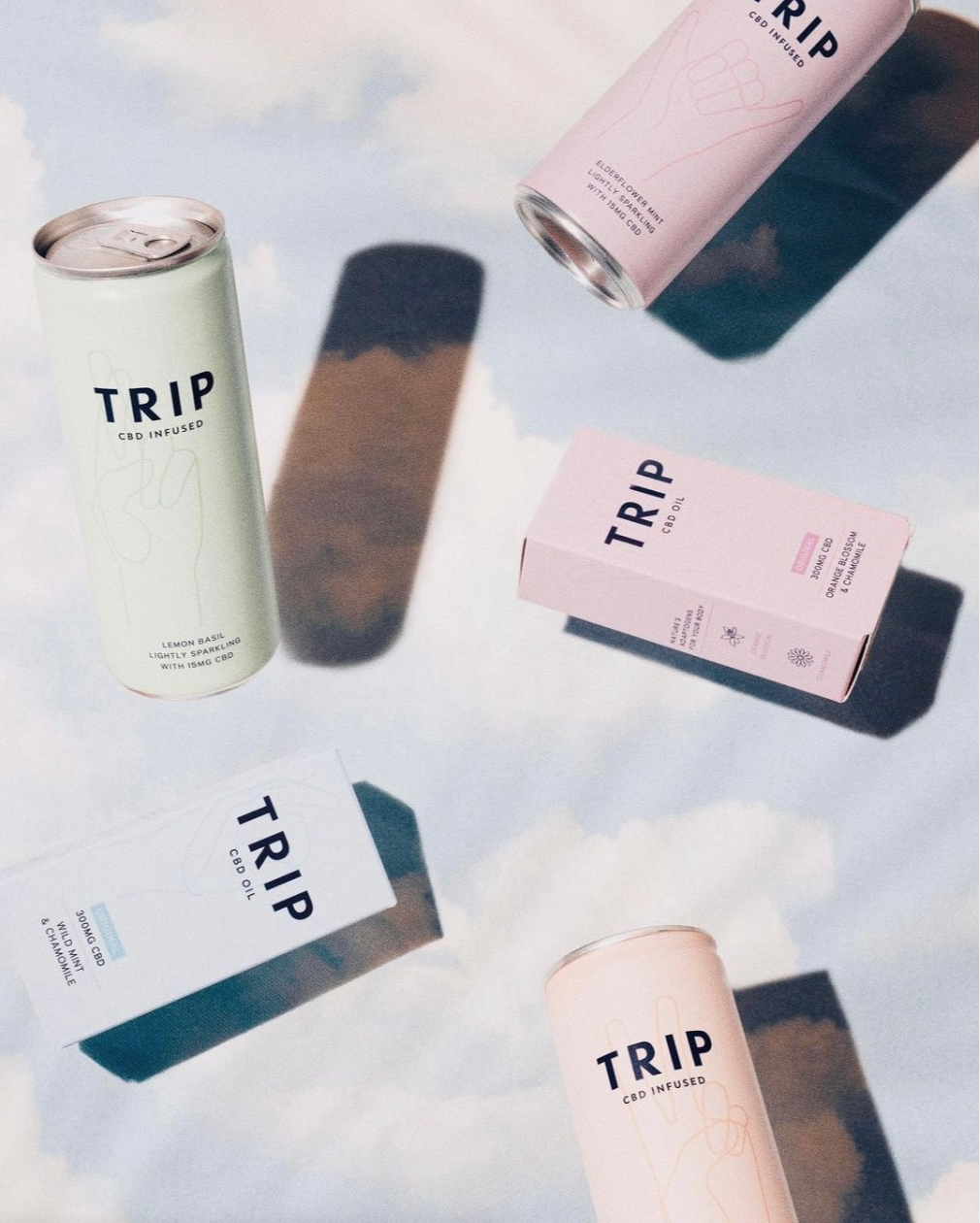
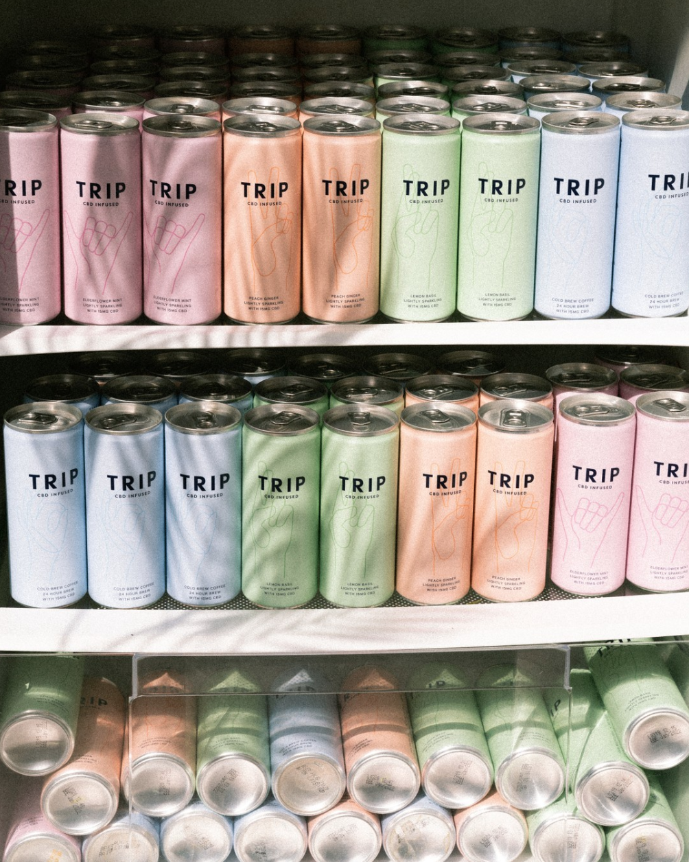
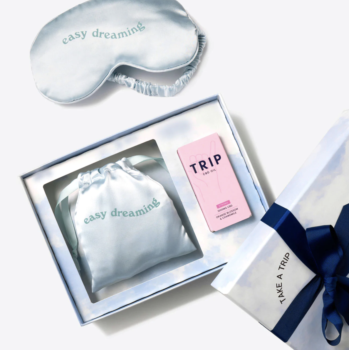
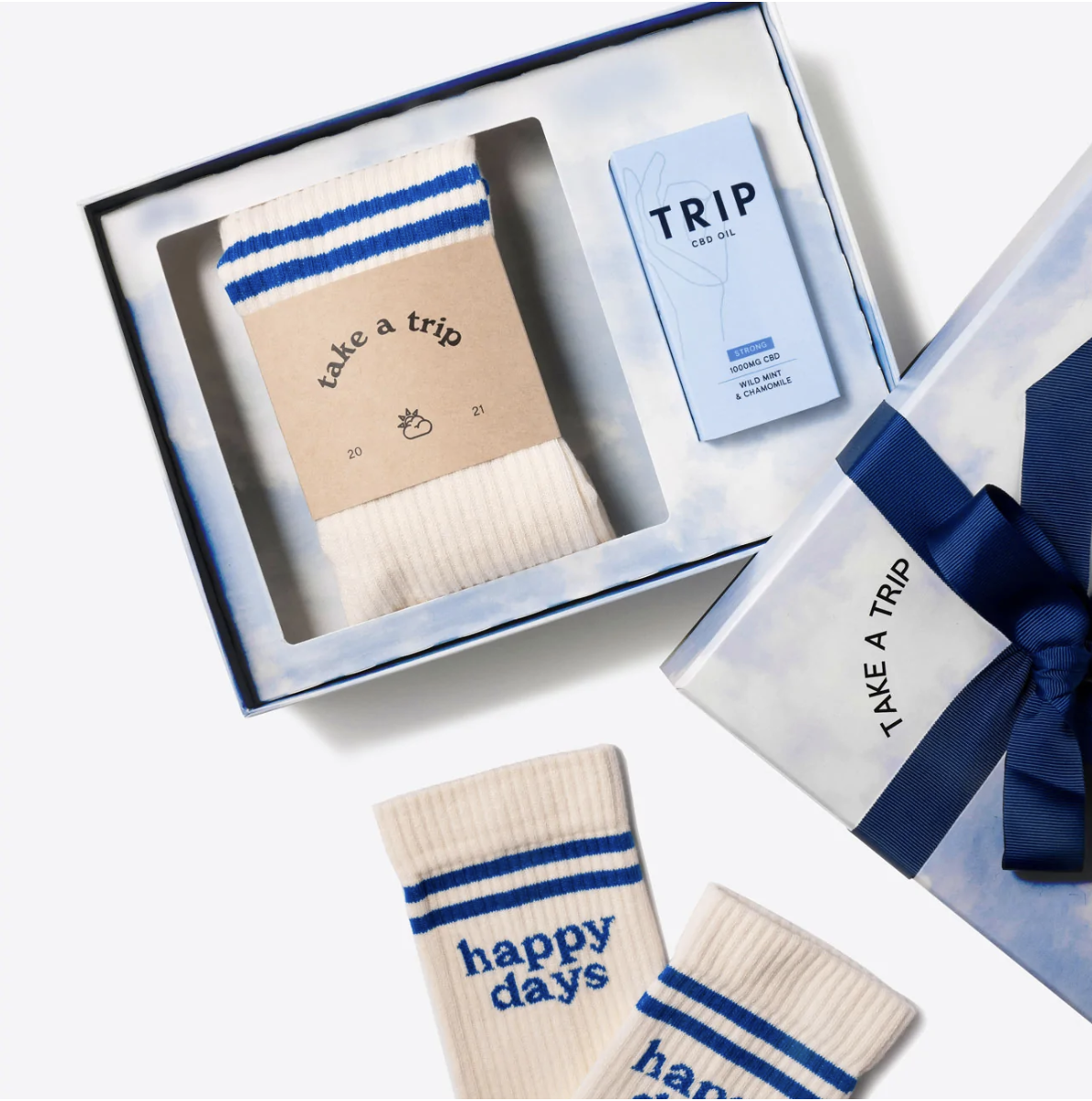
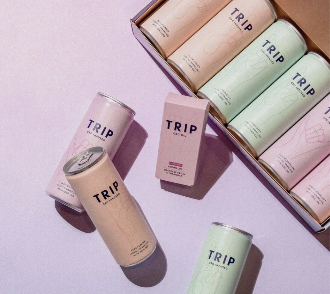
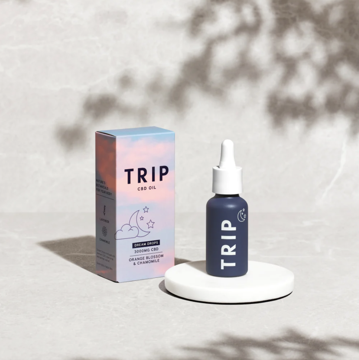
Trip
BRAND STRATEGY | BRAND POSITIONING | BRAND CURATION | COPYWRITING | BRAND WORLD | PACKAGING DESIGN | ARTWORK
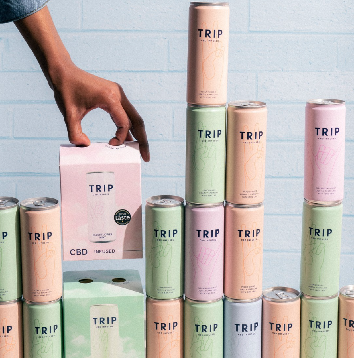
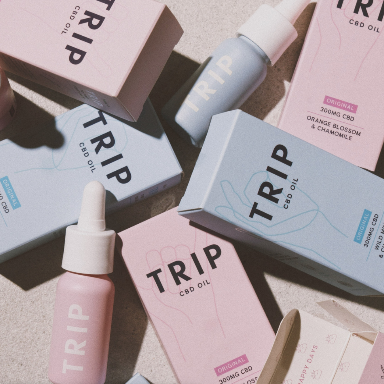
TRIP came to us in 2018 with a vision to change the perception of CBD in the UK, and wanted us to create a lifestyle brand that made the category feel desirable and modern. We created everything from the brand name, brand positioning and copywriting to the packaging design across the range. We actively wanted to create a brand that stood out from the CBD market, which at the time was heavily masculine looking and cluttered with cannabis leaves and wanted to create an identity that helps educate people around the ingredient and benefits, and position it as a much more approachable and every day product. Since launching in Summer 2019, they have successfully received listings in a range of premium retailers including Planet Organic, Selfridges, Harvey Nichols and As Nature Intended, and have been featured in media titles such as Vogue, Forbes, Guardian and the Evening Standard. Today we continue to work alongside their incredible team UK and Global team, updating artwork, creating new products and building their event stands.

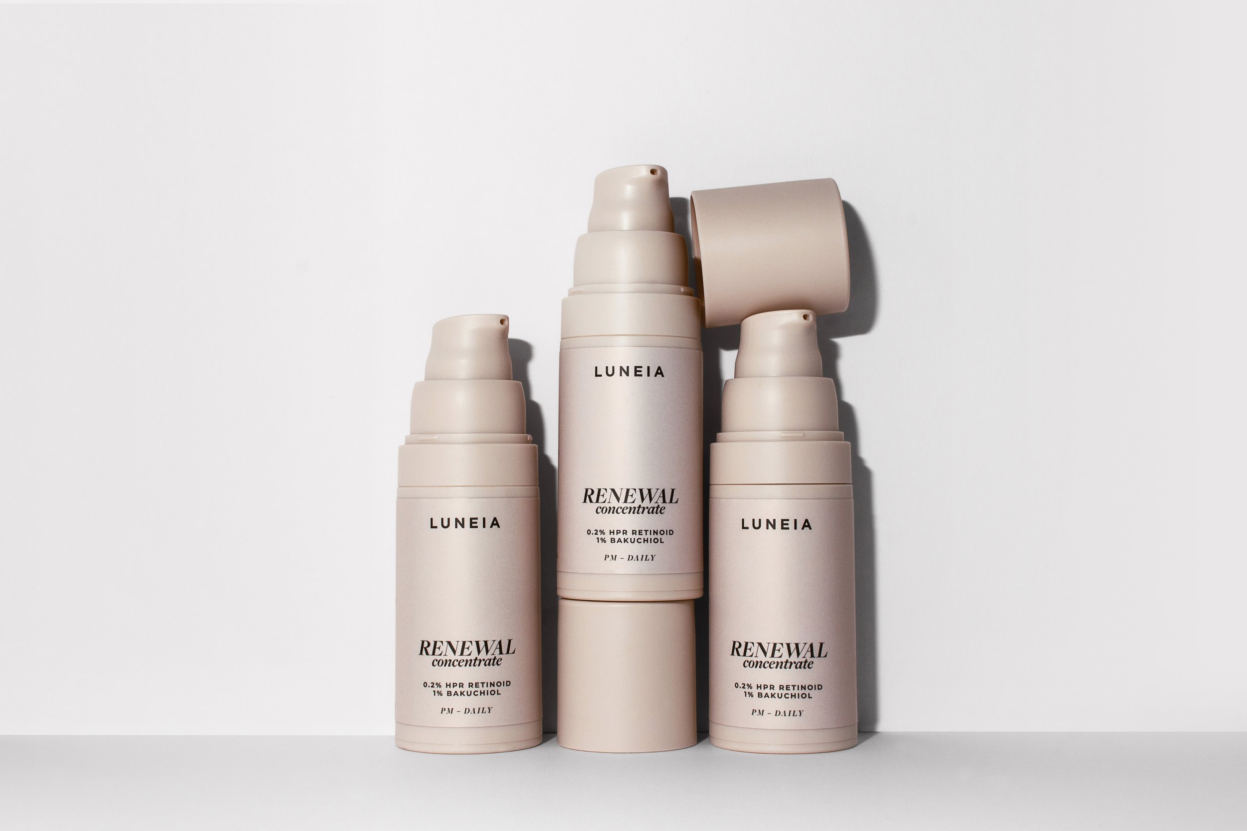

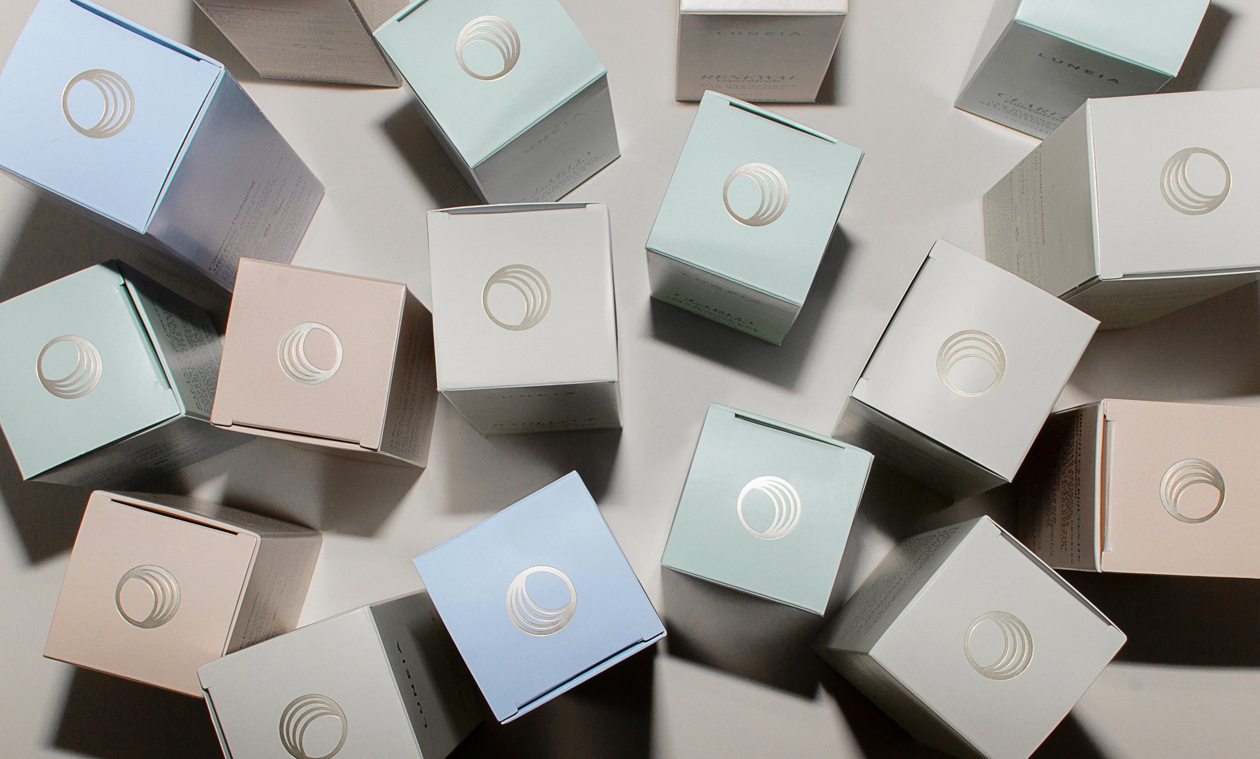
Luneia
BRAND POSITIONING | BRAND CURATION | COPYWRITING | BRAND WORLD | PACKAGING DESIGN | ARTWORK
Luneia came to us with an existing brand and popular product range which needed some further development and evolution before continue to expand the product range.
www.luneia.com


DANDS - Dips&Sticks
BRAND POSITIONING | BRAND CURATION | COPYWRITING | BRAND WORLD | PACKAGING DESIGN | ARTWORK
DANDS came to us with the task of designing their brand world which would feature a range of authentic global recipes. Their initial launch would focus on a Lebanese inspired range of dips & sticks. Neue Designs worked alongside the founders to define the brand’s strategy and positioning before getting stuck into the brand creation. The project involved defining the brand’s basic tools, logos, typeface and colourways before exploring their packaging solutions. There was a level on innovation involved with the packaging, not only to make it standout and perform, but to also allow for ‘snacking on the go’. We had to remind ourselves that unlike us not everyone eats 230g of hummus in one sitting, especially when it tastes this good, so the packaging allowed for the hummus to be opened and resealed. When designing the brand world and packaging we had to be mindful of their future plans and keep a few things up our sleeves that they could use for future product launches too.

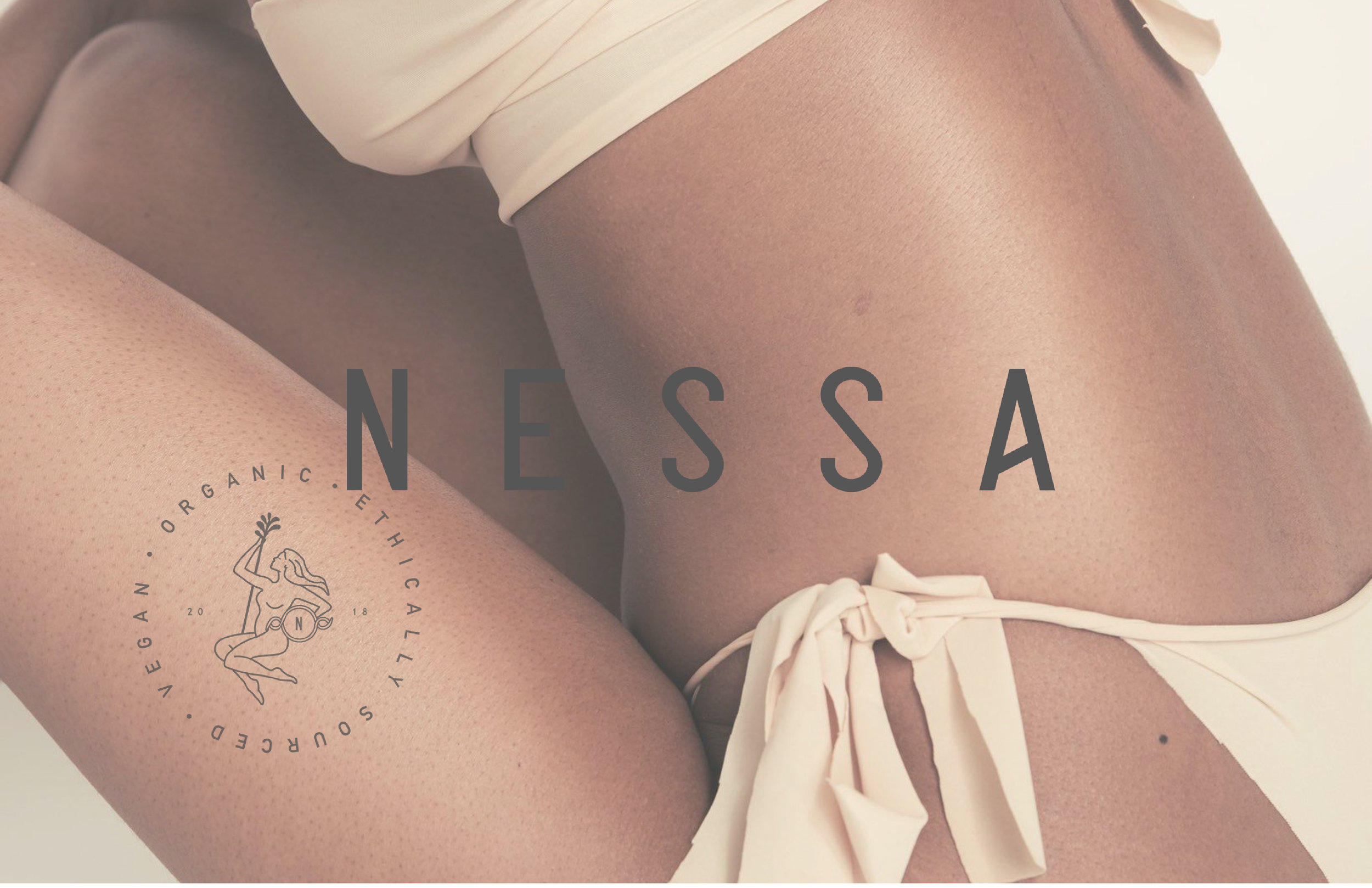
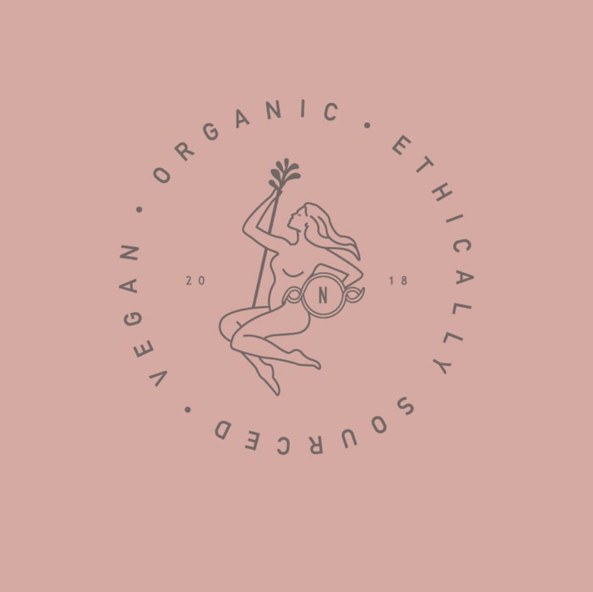


Nessa
BRAND STRATEGY | BRAND POSITIONING | BRAND CURATION | COPYWRITING | BRAND WORLD | PACKAGING DESIGN | ARTWORK
NESSA launched in April 2019, after working with founder Fiona to create a brand identity that would help normalise and modernise pregnancy and postpartum recovery skincare. Built on Fiona's own experiences with skincare as a new mum, the brand NESSA was created to have a straight-talking and honest tone of voice, and her identity was created based on an irish mythical warrior women to symbolise power and strength. Since launching online, Nessa is on a mission to bring a female-focused, 100% natural and organic brand to the market, and empower women to take control of their own recovery. The FreeFrom, Mum&Baby and Beauty awards that they have received are vast, and the 5* glowing reviews are a true reflection of the care and effort that goes into the brand.

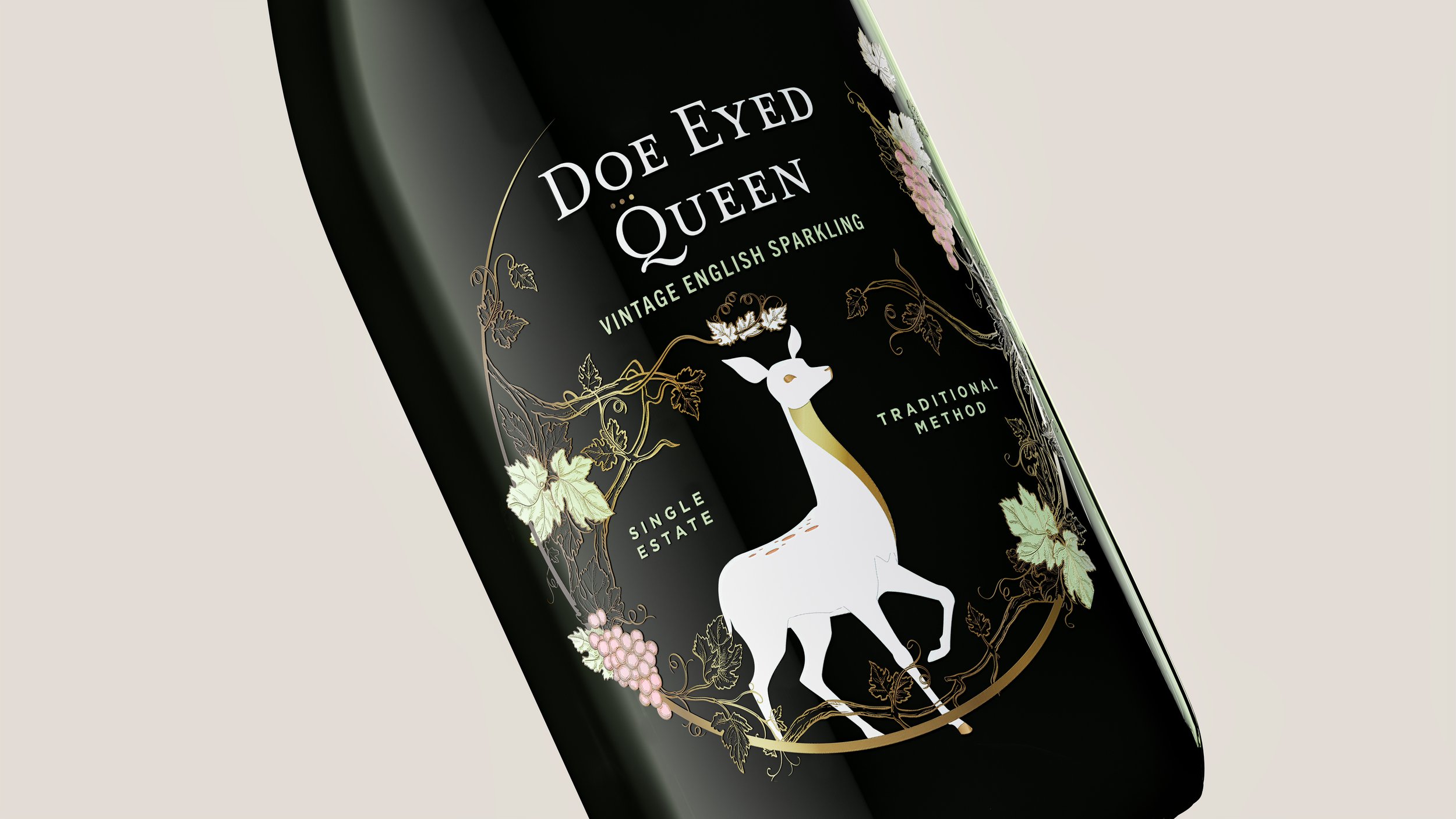
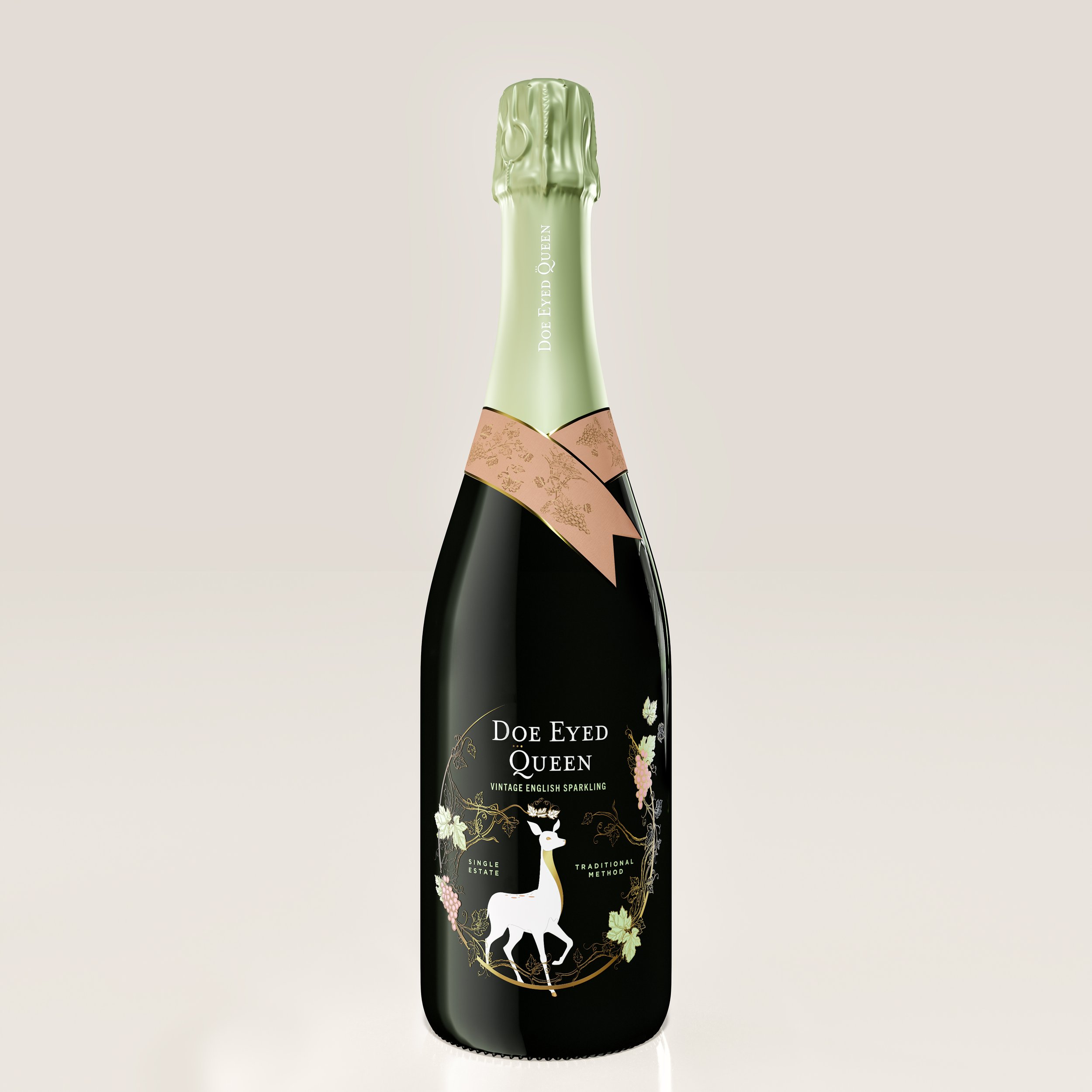
Doe Eyed Queen
BRAND STRATEGY | BRAND POSITIONING | BRAND CURATION | COPYWRITING | BRAND WORLD | PACKAGING DESIGN | ARTWORK
Doe Eyed Queen came to us in 2020 with a vision to create a premium brand that exudes the perfect blend or elegance and playfulness. They wanted to create a premium English sparking wine that appealed to the millennial market, that not only tastes great, but one that can also accessorize the table tops at high end restaurants and bars. Neue Designs helped the brand with everything from brand strategy, through to design and artwork creation ready for print production.


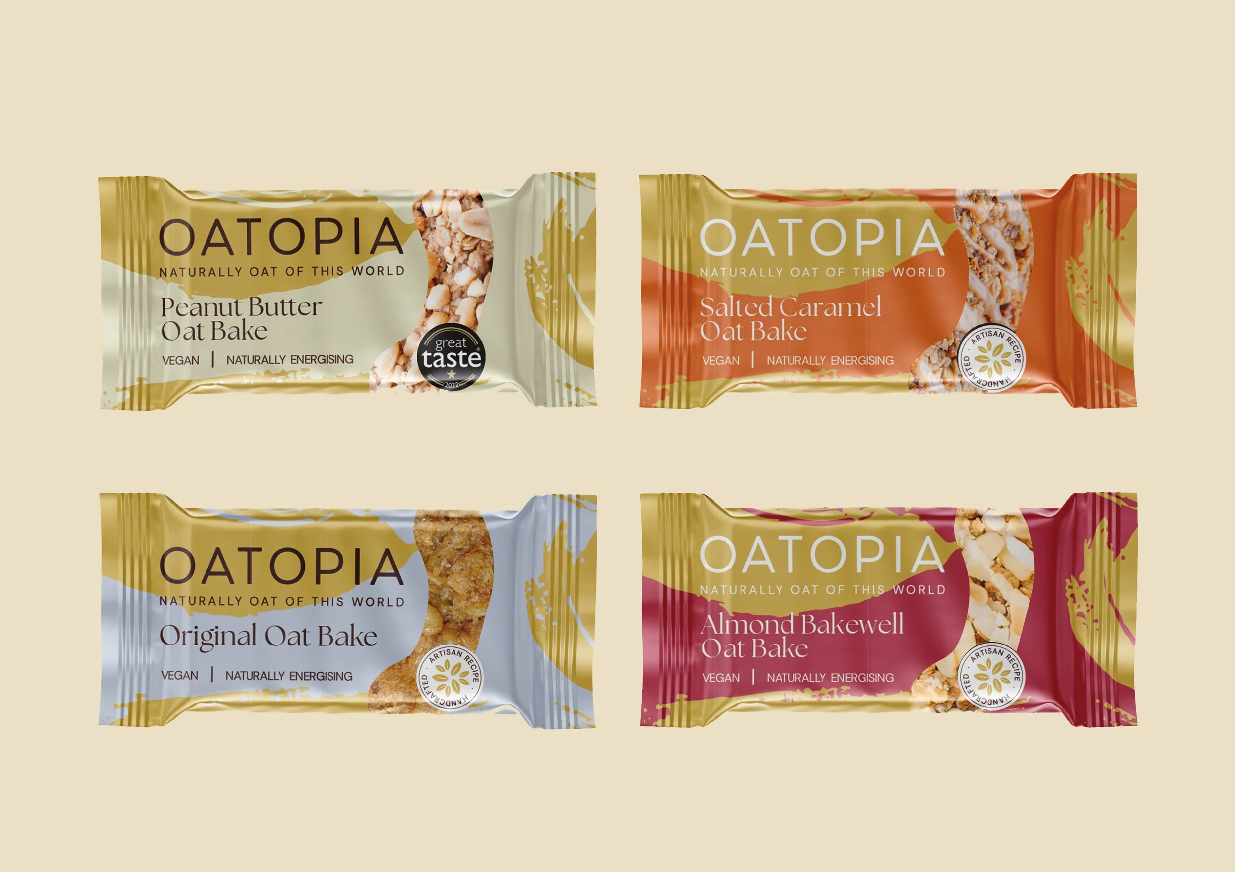
Oatopia
BRAND STRATEGY | BRAND POSITIONING | BRAND CURATION | BRAND WORLD | PACKAGING DESIGN | ARTWORK
Oatopia came to us to help them evolve their brand identity. Recognising the need to adapt and stand out in a competitive market, they entrusted us with the task of refining their image. We began by conducting extensive market research and consumer analysis to identify key trends and opportunities. We helped to define their positioning within the market right through to recreating Oatopia's brand world and packaging.


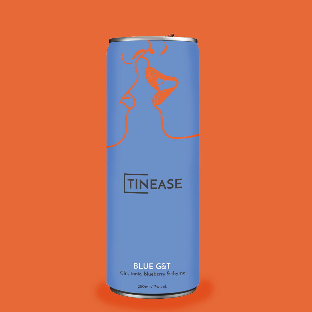


Tinease
BRAND POSITIONING | BRAND CURATION | COPYWRITING | BRAND WORLD | ARTWORK
We challenged the creative team to re-define the classic G&T drink in an increasingly on-the-go, 'convenience is king’ climate. We wanted to create an identity that would appeal to the millennial market, with a fresh, clean and cheeky design. Tinease is a modern brand intended to playfully tease the drinks & alcohol category, using simple illustration and bold colours.

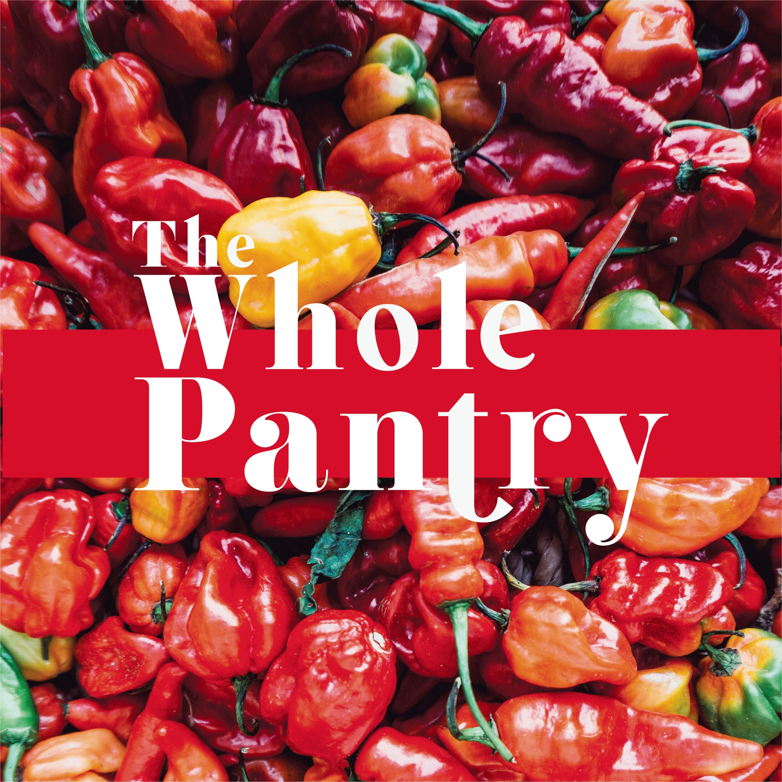

The Whole Pantry
BRAND STRATEGY | BRAND POSITIONING | BRAND CURATION | COPYWRITING | BRAND WORLD | ARTWORK
The Whole Pantry is a direct-to-door meal delivery service who wanted an identity and positioning that represented wholesome, fresh and delicious foods. We wanted striking food imagery to be the central focus of the brand with a strong logo and typography being the consistent and familiar factor. This branding concept was part of project whereby our other route was carried forward, but we liked the vibrancy and freshness of the route too much to leave it in the archives. So we've changed the name, but kept the brand's look and feel the same.


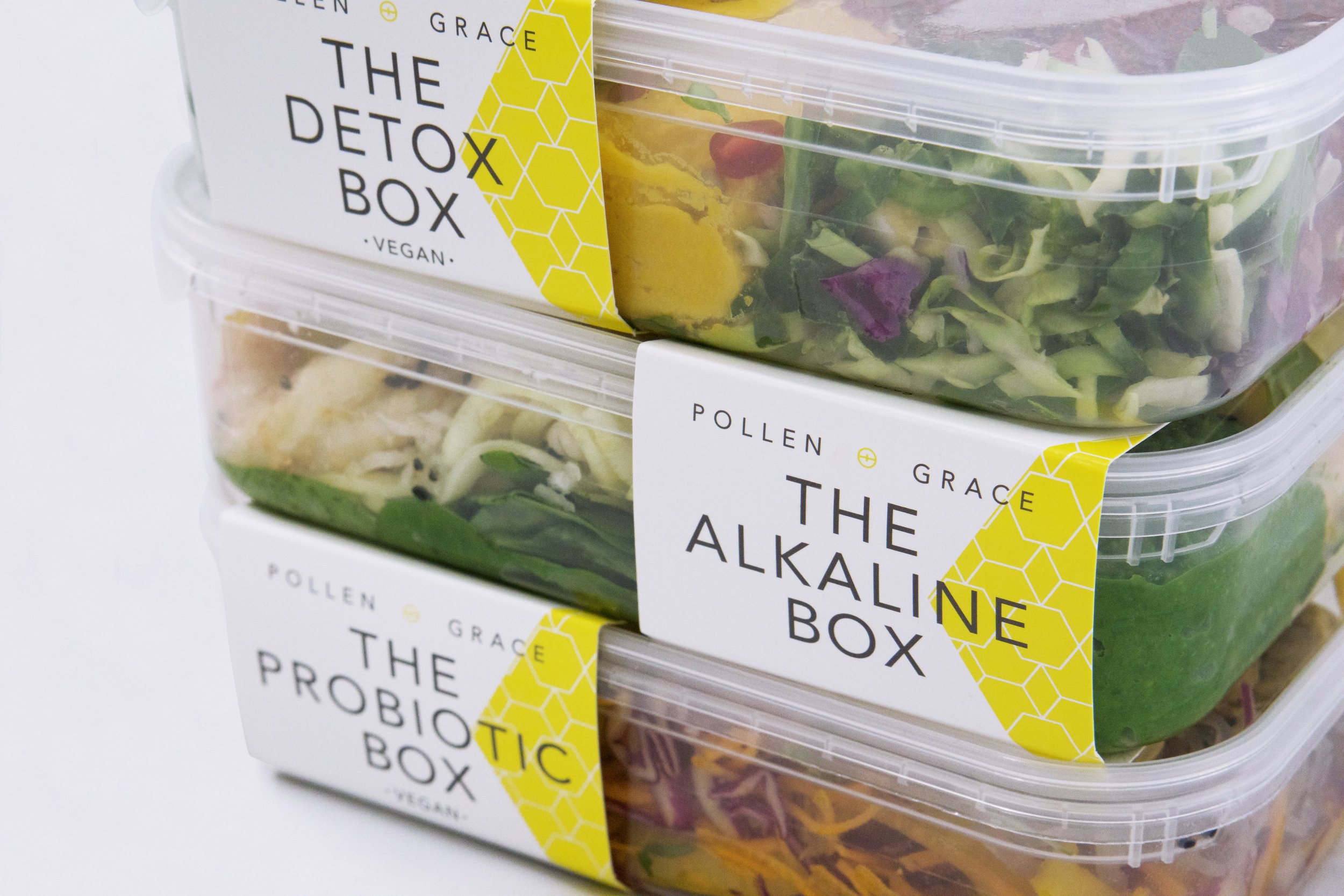


Pollen+Grace
BRAND EVOLUTION | COPYWRITING | BRAND WORLD | PACKAGING DESIGN | COPYWRITING | ARTWORK
Pollen + Grace came to Neue Designs wanting to evolve their identity to be more retail ready, have clearer USP messaging, and also help create packaging identity that was more suitable for a retail environment. We have worked with Pollen + Grace across a range of product extensions and NPD, and have also designed their pop-up event stands.
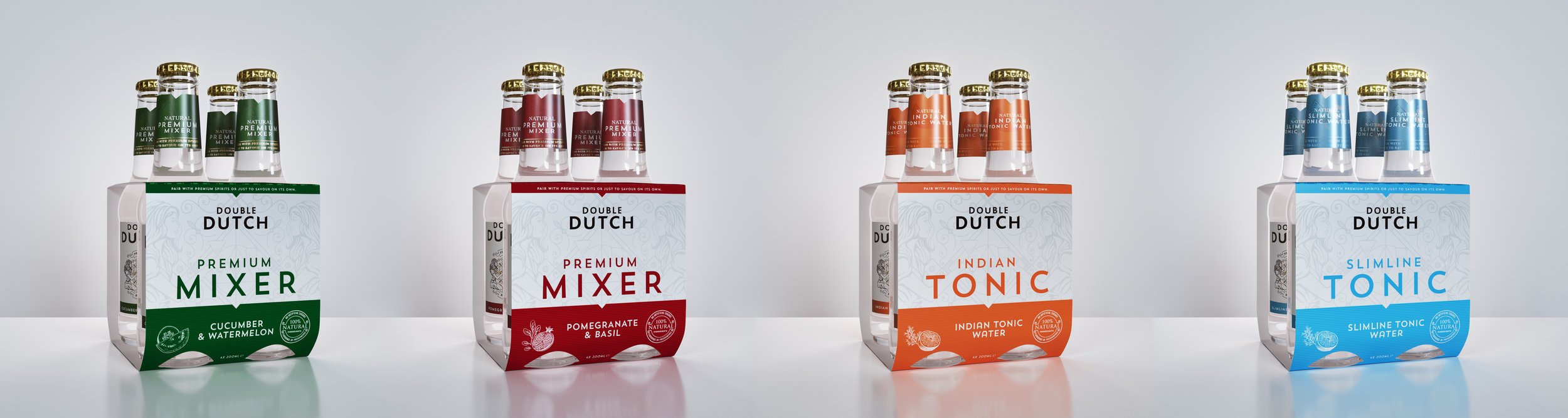
Double Dutch ARTWORK | PACKAGING DESIGN | PROJECT MANAGEMENT
Double Dutch, a premium tonic brand, came to Neue Designs to create and design their multiple-pack packaging for the range of 4 flavours. The brief was to create a design solution that was eye-catching, had clear branding and messaging throughout and was structurally suitable for a retail environment.
Follow us @neue_designs #neuework
Neue Limited Copyright 2023